
Responsive navbar bootstrap 4 (2)
Step 3: Creating responsive navbar:
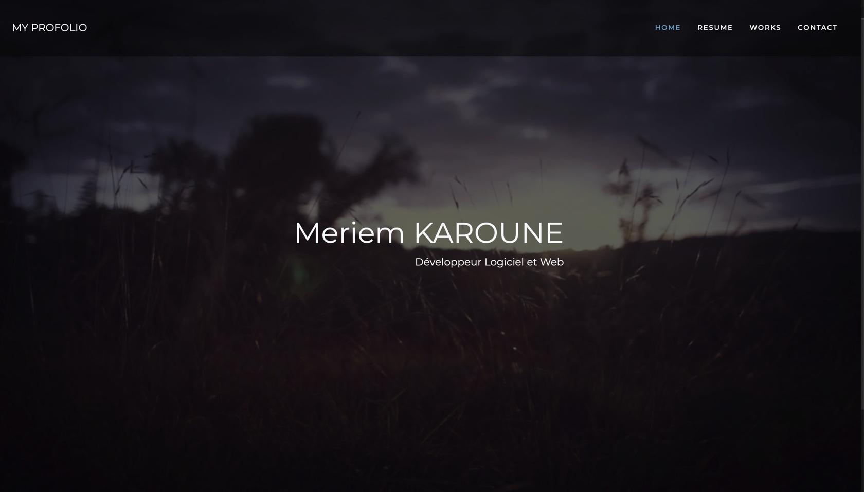
Desktop version :
Mobile version:

Next step is to add a bootstrap navbar and use css to customize the navbar. In the style.css, we use the classe .nav-menu to create the menu nav by indicating the background color and background pading. Then, we add the .menu-item to make the items' font color white and we modify the font size and the spacing.
Following is the code to add to the previous project Portfolio with bootstrap 4 (1)
Index.html :
style.css :
Navbar animation:
Now, we are going to add some animation on navbar when the page is scrolled. We use CSS to add the class .custom-navbar which modify the nav padding and background when the page scrolling is detected by javascript.
style.css:
script.js:
PS: Add some white spaces in the index.html page to enable the scrolling and see the navbar animation effect.
Add a comment